
Kerrang! Music magazine
The front cover is overly busy piece of media which consequently leads to four heads cover the title of the magazine which makes the magazine appear as arrogant about there product. Also the fact that they have added more than one cover artist to the front cover which makes them seem indecisive as which is the cover story therefore creating a confusing concept to the audience.
The cover as a whole is also overly edited using artistic fonts and paint like banners to section their information. They seem to picture a feature artist as a collage and then add the name of the artist layered on top of the image. All photos used are all head or mid shots enabling them to be used as part of the collage but not allowing much image diversity.
The colour scheme continues the busy theme by having a four colour scheme including black, yellow, red and white.
The banner at the bottom of the page simply lists other bands included in the magazine. The barcode is surprisingly not at an edge of the page and has small not tiny information on it including: the issue number, date, price and website.
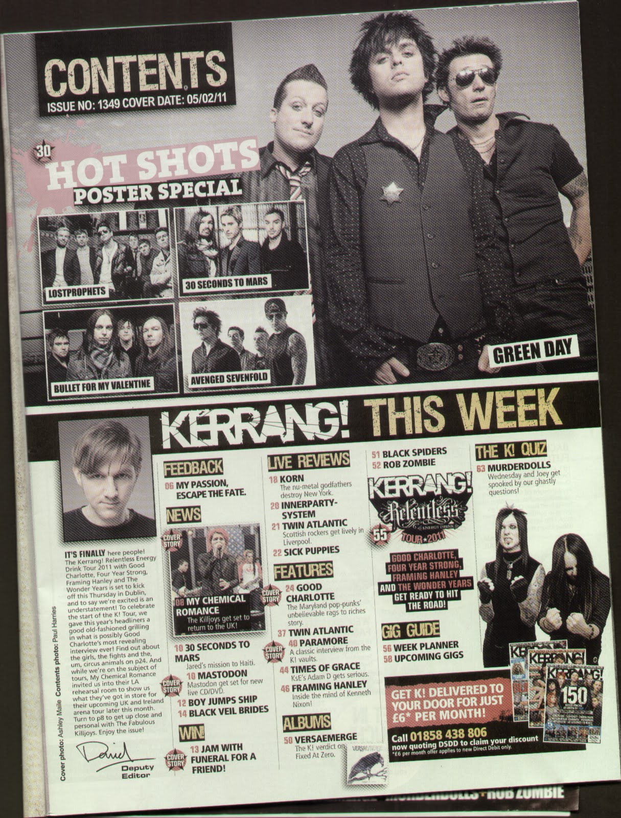
The contents page is only over one page and seems to be more organised and less busy than the cover. The page is split in two with a thick black banner in-between with the images of feature articles above the line. The images are split into a window of 4 smaller images and a main which are all landscape posed group photos. Below the banner it is split into columns. The first column is a small editorial with the editor’s photo at the top and signature at the bottom. The other 4 columns are filled with a list of what you will find in the rest of the magazine which is split in to sections. The sections are: Feedback, News, Win!, live reviews, features, albums, gig guide and the K! Quiz. All the other images in the bottom section are thumbnail size and are all action shots. Any article in the list is stamped by a cover story star stamp on the left hand side.
In the bottom right hand of the page there is a subscribe advert with thumbnails of other K! front covers.
The characteristics of this contents page seem to continue the artistic fonts, banners, colour scheme and have credits in small print going up the side of the left hand margin.

The double page spread is focused on Paramore which is the title of the article. the layout is image dominated as the layered images go over the middle line. The main image is of Hayley Williams the controversial front man, or should I say front woman, of the band. The rest of the images cover the rest of the band members but all images are of one band member and only mid shots.
The main body of the article flows over two columns in a continuous article style written in paragraphs and only broken by a quotation on the second column which is written in bold. The text size is small about text size eleven or twelve.
Except for the name of the magazine repeated next to each page number in the bottom corner of each page there is no extra text used on the 2 pages.
No comments:
Post a Comment