Showing posts with label analysis. Show all posts

Friday, 4 March 2011

Kerrang! magazine analysis

Kerrang! Music magazine

The front cover is overly busy piece of media which consequently leads to four heads cover the title of the magazine which makes the magazine appear as arrogant about there product. Also the fact that they have added more than one cover artist to the front cover which makes them seem indecisive as which is the cover story therefore creating a confusing concept to the audience.
The cover as a whole is also overly edited using artistic fonts and paint like banners to section their information. They seem to picture a feature artist as a collage and then add the name of the artist layered on top of the image. All photos used are all head or mid shots enabling them to be used as part of the collage but not allowing much image diversity.
The colour scheme continues the busy theme by having a four colour scheme including black, yellow, red and white.
The banner at the bottom of the page simply lists other bands included in the magazine. The barcode is surprisingly not at an edge of the page and has small not tiny information on it including: the issue number, date, price and website.
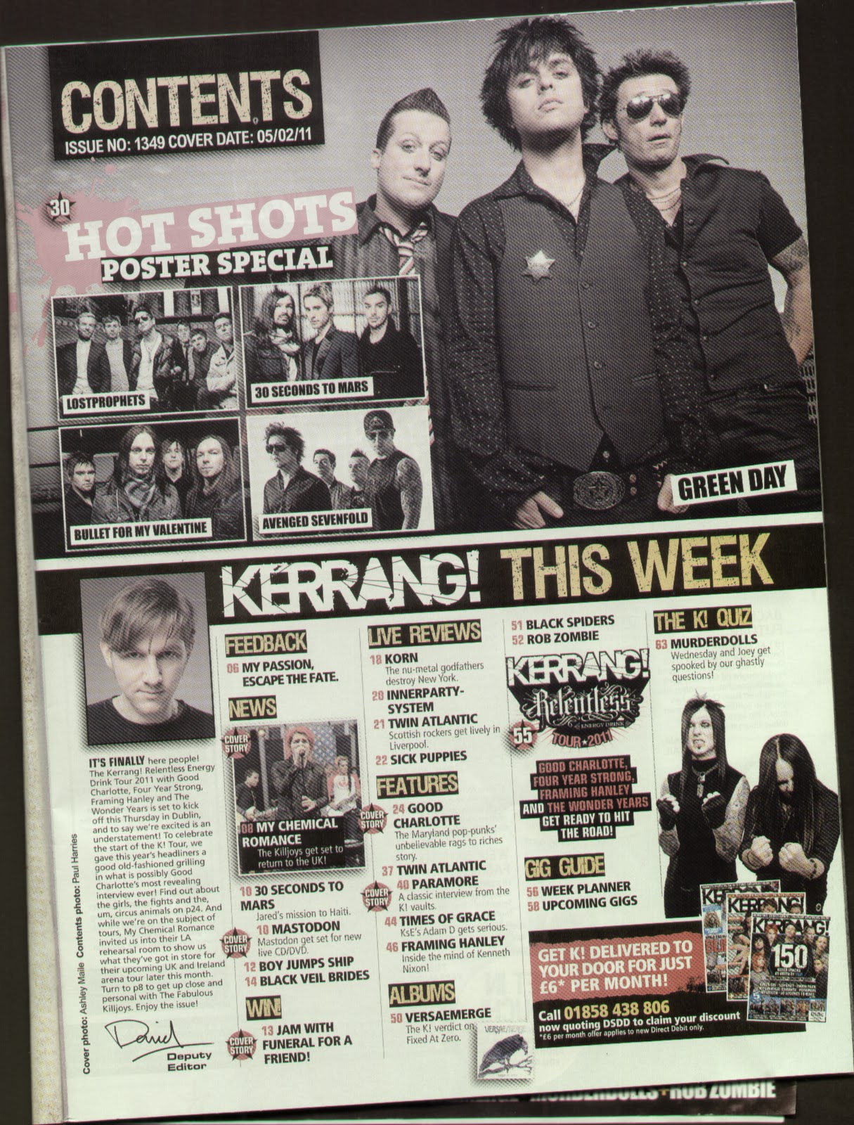
The contents page is only over one page and seems to be more organised and less busy than the cover. The page is split in two with a thick black banner in-between with the images of feature articles above the line. The images are split into a window of 4 smaller images and a main which are all landscape posed group photos. Below the banner it is split into columns. The first column is a small editorial with the editor’s photo at the top and signature at the bottom. The other 4 columns are filled with a list of what you will find in the rest of the magazine which is split in to sections. The sections are: Feedback, News, Win!, live reviews, features, albums, gig guide and the K! Quiz. All the other images in the bottom section are thumbnail size and are all action shots. Any article in the list is stamped by a cover story star stamp on the left hand side.
In the bottom right hand of the page there is a subscribe advert with thumbnails of other K! front covers.
The characteristics of this contents page seem to continue the artistic fonts, banners, colour scheme and have credits in small print going up the side of the left hand margin.
The double page spread is focused on Paramore which is the title of the article. the layout is image dominated as the layered images go over the middle line. The main image is of Hayley Williams the controversial front man, or should I say front woman, of the band. The rest of the images cover the rest of the band members but all images are of one band member and only mid shots.
The main body of the article flows over two columns in a continuous article style written in paragraphs and only broken by a quotation on the second column which is written in bold. The text size is small about text size eleven or twelve.
Except for the name of the magazine repeated next to each page number in the bottom corner of each page there is no extra text used on the 2 pages.  

The Word analysis

The word magazine

The front cover of shows more of a diverse magazine that is not fully given to music as it likes to dabble into film and television however the music is the main feature of the magazine. The genre of music taken into account in word is world music in the alternative genre and comes from the Planet rock family.
The title of the magazine is the largest text on the page and is bold, but rather individual text. The fact that they have a sticker on top of the title of the magazine saying “music magazine of the year-again!” helps you to understand the proud but also quality of what is inside.
The text on the front cover is long and wordy therefore aimed at an older mature audience. 
All images on the cover are in black and white or a tone of sepia which is a great contrast to the primary colours of the boxes and headlines on the page. The way the main image of Kate Bush is positioned straight with her eyes looking straight at the reader suggests a chance to see what she is really like underneath the worldly successful solo artist. The other images on the page have no link to music therefore aren’t in the audiences direct interest so are smaller and positioned to the right of the page.
The Word positions the artist of the cover story in large and bold colourful text underneath the title of the magazine enabling it to stand out on the black and white photo-ed background.  The magazine has an obvious colour scheme of bright primary colours on black and white or sepia-ed backgrounds. Bold headline text also uses shadow to make them look 3-d as if it jumps out at you when you pick up the magazine.
The banner down the right hand side tells the reader other things which it can find in this months issue and has an individualistic style with its serrated edges to give it more depth. Underneath it is the horizontal barcode which tells the reader clearly the date, issue number, price and website.
The contents page is set out in two columns with a large strip separating the two sections as it only covers one page. At the top of the page there is a red banner which repeats the title of the magazine just slightly smaller and in white instead of red. On the right of the banner the title contents page is bold in an Arial like font but underneath a line is the issue number and date of issue.
The left column has two images at the top which relate to the list of articles on the right hand column however the main image on the contents page is of the film section which is something I will not use in my music magazine. Underneath the images is a small editorial message which has a photo of the editor with somebody else which is then signed and has an email address to help with communication to the magazine. The editorial is written in the first person therefore is a very bias bit of journalism that can be on anything which relates to the issue or what has been happening in the media with relation to the editor that week.
The right hand column is basically a list of articles and features merged into one which can be found in the rest of the magazine. Anything which has been advertised on the front cover has a stamp next to it simply stating “on the cover”.  Some articles which have a collective heading which are regular to the magazine have a light grey box around them. The colour scheme of this column and this page is red, blue and black.
At the bottom of the page on the left hand side is an offer which promotes subscriptions which is a big thing to any magazine especially music magazines. Underneath the advert in the block arrow is the web address in small print and on the opposite side at the bottom is the issue date as well as the page number.
The double page spread takes the form of a question and answer article and spreads the article in six columns over the two pages with the colour scheme of the two pages is black, white and red. The double page spread as a whole is more text dominated.
The layout of the two pages takes the form of headline of the artists name in bold large font and tagline of the article taking up the top third of the first page. Then the main image one and a half thirds on the second page and the rest of the article continued underneath.
The main article has one column of general article information which sets the scene and gives brief background information about the artist which the double page spread is about, in this case it is “Lilly Allen”.  The rest of the columns follow a regular question answer layout and structure flowing from column to column. The article finishes with letting Lilly give a message to the world and then ruling of the article which shows the article has come to a definite stop. Underneath the ruled line there is information of when fans can buy her latest album which is in the same font as the main text.
The images that are included in the article are both posed but both have different settings and compositional features used. The image on the first page which breaks up the text is an old photo taken for different purposes of the artist when a child. The image is tilted to an angle to make it more interesting and enabling it to fit it in to the gap in-between the two columns and has the caption written on the image in white writing so it is legible. The main image on the second page is of only Lilly in a typical seated photo shoot position because the pose is very precise and the costume, hair and make up are in pristine condition. Plus it is something I wouldn’t usually associate with Lilly Allen wearing.
The characteristics of a Word double page spread is the “fact time” logo which seems to be found at the top of the page of all feature pages within the magazine. The other characteristic which the magazine keeps throughout is the web address, date of issue and page number at the bottom of each page.

Thursday, 3 March 2011

MOJO magazine analysis

MOJO music magazine
The front cover of MOJO is black and white giving it its alternative edge straight away allowing the reader to determine the genre instantly. The page is also dominated by text as there are no spaces left which is a method some people see as cluttered and some see as professional because they are using every available space and not wasting paper.
Queen being about the same size as MOJO makes it more important because the band name can sell the magazine by itself. The colour scheme also includes rustic silver and gold creates royal connotations of “Queen”, but the rustic effect symbolises that they are an old band and haven’t been around for quite some time.
Freddie Mercury being the positioned in the centre of the page with his head in the top middle third with his eyes looking straight at you helps you to understand that even though the page says Queen first the article is all about him. The way he looks straight at the camera and is hugging himself suggests that reading the feature article you will find out about who the real electrifying front man once you stripped back his persona on stage and rock god image. I get this impression because the pose makes him look vulnerable. The fact that it is in black and white and not the best quality demonstrates that it is an old photo reused which is more apparent and noticeable saying he is no longer alive. This also means that readers can tell what type of feature article it will be by the cover artist; in this case it will be a look at the history of one of the most well known front men of the last 50 years.
The majority of the text is written in a sharp font except for the word plus which the editor has decided to take on the persona of the word and write bold and rounded. The main theme throughout the text is that artist’s names are more important than catchy headlines. At the bottom left of the page there is simply a list of artists who are also included in the magazine including massive classic rock names such as ‘The Who’ and ‘Airplane’.  Throughout the language itself MOJO uses a lot of superlatives as persuasive techniques on their front page but they are all included in-between the title of the magazine and the name of the feature artist in the centre of the page. They also seem to use a lot of exclamation marks to make the text look amazing to the reader.  
I have also noticed that every heading is rustic gold and then the writing underneath is rustic silver so they have an ongoing colour theme which is also used through the writing as well. They also use a top corner incentive of a “FREE CD” with the small print and helpful legalities writing in minute font at the bottom of the same side. On the opposite side of the page in the same place is the barcode which on this occasion is horizontal and includes: the date, issue, the price of the magazine when bought in the UK as well as USA and Canada.  
The contents page is image dominated because in this case the image is used to fill the whole page however like Q this contents page actually covers two pages however I have chosen one to analyse as I will only be doing one page in my product. For this genre I don’t mind an image dominated magazine as it brings vibrant colour to the page and doesn’t make it overly busy.
The quality of the photograph used for this page is amazing the way that the subjects are off centre and fully in focus whilst the background is just a blurred whirl of colour and even though there is someone standing behind the artists in focus it doesn’t matter because you don’t notice. The setting of the photo is abstract which is in keeping with the alternative genre.
The layout is spaced out but organised with the list of features skirting the edge of the main focus of the image. Each headline written in white bold and rounded font with a brief description underneath in smaller text which I would say is about text size 12. At the top of the page the magazine title is written again in its stylised sharp font and boldness, but in white this time to keep in with the colour scheme of the new page. The colour scheme for this is completely different to the front cover however it still uses two colours for the text. On this page the two colours are peach for the page numbers down the left hand side and white for the rest of the writing. The titles of the page sectioned which are lined out are also written in the peachy colour highlighting that general features are different from the cover story. The cover story is situated at the bottom of the page in a section by itself.
On the bottom right of the page a quotation is used to advertise the arcade fire feature article to the reader. It is written away from the rest of the features because the feature article is the one which is photographed.
Characteristics of a MOJO contents page are to always have the three cities where the MOJO headquarters are located within the countries in which it distributes its product to. It also always has the date and issue number in the transparent banner underneath the magazine title. Also not forgetting the tiny page number and the title of the magazine just made smaller still in a white font.    
The double page spread is a history article looking into the life of the classic and iconic front man of Queen, Freddy Mercury. This is a common feature of MOJO as they like to remember the legends of music especially those who have died before their time.
The page has three different fonts, not including the MOJO logo which is written at the corner of each page next to the page number. The first is used, next to the large bold drop letter which creates an obvious start to the article, is the initial paragraph to describe what the article is about similar to that of a lead in a newspaper article. The fact that it has characteristics similar to that of a newspaper summarises how good the quality of the structure and the content is in the magazine making the target audience of a mature age. This is due to the amount of writing included and the size of the font used for the main body of the text. The second type of text is used for the main body of the text and the third is used for the quotation underneath the main image on the second page.

Images are used in variety within the article as if an extra lining tactic by the editor as part of the layout. The margin image of Freddy’s head and flared and booted foot creates a straight line for the article to handrail down the page making it look more neat and sophisticated. The four images on the first page are laid out as a window act as a page break to break up the continuous prose which the article takes.  The images as well as the page continue the colour theme from the photography on the front cover through to complete the article with a running theme; in this case it is black and white.