Graph 1 shows that Adele and Gaslight Anthem where the most popular bands to find a feature article about. For my magazine i will deffinaitly use Adele as my main feature because I already have someone in mind to be my model. Gaslight Anthem can be added as my second feature artist and any other feature artist will have to fit with the majority of the bands highlighted in this graph as equal.
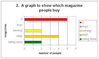
Graph 2 shows that Q is the most popular music magazine by one person and NME is second as it only has one less. MOJO is the least popular music magazine with my target audience which is probubly because it is a magazine you either likeor dislike as it is very strong aternative audience.
Graph 3 shows that the majority of the people who answered my questionnaire prefered cover A, NME and M which was MOJO. I can see the logic by why half of the majority chose the NME cover because they selected it as there favourite magazine however the reason why te other half selected MOJO is different. The only reason M was selected as a favourite was because the colours selection creating the special edition. The main reasons why where that both front covers adhere to the codes and conventions of a conventional music magazine having the cover artist photographed in the centre or just off centre of the page with the eyes positioned in the top third. This is something which i will aim to include on my front cover.
Graph 4 shows that the overwhelming majority of my target audience choses which magazine to buy depending on the quality of the photos, who is actually photographed on the front cover and what artists are named on the front cover. To adhere to this in order to make my target audience want to buy my music magazine I aim to only use the best quality photos and only include artists which my target audience will be interested in.
Graph 5 shows that the overwhelming majority of my target audience think that artists in the 'indie/rock/alternative' genre are the artists they expect to find in a music magazine they would read. Therefore when planning the artists to include in my magazine I should make sure that they fit into this genre catogary.
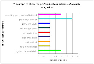
Graph 7 shows that the overwhelming majority prefer to see some red in a music magazine's colour scheme and not far behind are the people 'against black and white' as well as people wanting to see something glossy and sophisticated.
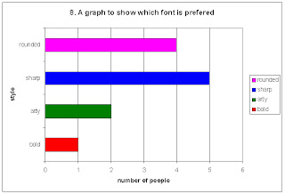
Graph 8 shows that a sharp font is prefered therefore this is what i will use to write the name of my magazine on my front cover.
Graph 9 shows that the top three features which people like to find in a music magazine are gig reviews, interviews and articles about artists. In my magazine i will include these three as the three feature articles highlighted on my contents page.
Graph 10 highlights that 'tours/gigs/festivals' and 'new albums' are what poeple like to read about. The next point highlighted by this graph is that they like to read about different genres.
Graph 11 highlights that the majority of my target audience prefer to have a contents page mixed of text and image, not overly dominated by one or the other. However two more people selected image dominant over text so when I construct my magazine I will use powerfull images but keep a more even balance.
The main result for querstion 12 was to use 'a variety of images set out in the text'. They also stated that pictures and collums where the best way of creating this concept on the page.

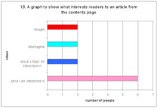
Graph 13 highlighjts that I must use artists which my target audience like and would appreciate reading about in order to make my magazine succesfull.
Graph 15 shows that the overpowering majority of my target audience prefers special issues for magazines.
Graph 16 shows that people prefer naturally posed photographic compositions however they do like to have a mixture of posed and natural. Posed photos where also highlighted as looking more proffesional therefore I will use them for the impacting images on my magazine.
Graph 17 shows that the over powering majority prefer natural lighting being used for photographs in magazines so when taking my photos i will try my best to include as much natural light as possible.
Graph 18 shows that my target audience tend to assoca band with the front cover of magazines however 4 people stated that depending on what was featured is what will apear on the cover. In my magazine this is what I will use to my strength.
Graph 19 shows that the majority of my target audience would like to see a female artist on the cover of a music magazine.
Graph 20 shows that the minimum amount that the majority of my target audience would spend on a music magazine is £3 and the maximum is £5. Therefore I will make my music magazine cost somewhere in the bottom half of that bracket.


No comments:
Post a Comment