Friday 25 March 2011

Diary Entry: week 6

Construction begins!
This week I started to use photoshop to construct my magazine pages for the majority of the week I was working on the layout of the three pages. Once the pages were fully layed out I began to do some extra research for photos which was narrowed and information was fed into my photo planning grid. I also used my  sketched ideas as well as my existing magazine analysis of Q to work out what layout worked when inserting it into the Photoshop 4 software.
The thing which I managed to spend the most time on this week was trying to create a 'ALTERNAE' logo for my magazine with a wrongly slanting T, however when te calenge became to much I scraped the idea.   

Diary Entry: week 7

The construction continues
This week my magazine has really seemed to come to life because on Monday I managed to finish the basic layout, including the text and exactly where the photos would go on the pages by adding blank boxes temporerly. I also got in contact with my model who was being Adele to check her availability so planned to do them on thursday night infront of the white screen in the media room. I also told Hannah (my model) instructions of what to wear aswell as guidlines for make up, location and a time. Also on the Thursday i took my beatles photo to go with my DPS article, which the boys where suprisingly helpful for.  

Friday 18 March 2011

Diary Entry: week 5

Magazine designing has begun!
For the majority of this week I have been working on designing my magazine by drawing out deigns on A4 paper. Before I started drawing the final designs I looked back ove my initial ideas to try and put all of my ideas together in my head before putting pen to paper. 
By the time the ideas where sorted in my head I had chose Q as my style model and my cover artist was going to be Adele. My colour scheme is going to be red, grey and white to give it a proffesional and slick look.
When starting to sketch out the pages which I envisaged in my mind I also designed the magazine logo and sketched out photo ideas before researching poses used before to portray the arists as I knew it will influence what I thought was appropriate, therefore creating more ideas for my photographic compositions. I then created 3 A4 full designs for contents page, Double page spread and front cover. All 3 pages where then scanned into the computer and uploaded to my Blog.    

Monday 7 March 2011

Diary entry: week 4

music magazine research
Over the last week I have been working on completing the 5 magazine analysis' and sorting out my results from my audience research questionnaire.
I completed my reasearch of each magazine at a time instead of doing all front pages together, all contents pages together etc. I did this  because I believed it benefited my reasearch more by helping my understanding of a whole magazine and the themes brought all the way through. The magazines which I annalysed where: MOJO, Q, NME, the Word and Kerrang!. Kerrang! was a magazine I annalysed as an extra to highlight features of a rock magazine which I didnt want to include in my final product because it wasnt aimed at my target audience. All analysis' where added to a new post on my blog making it easier to navigate and browse when overlooking my research when creating my actual magazine.
For the audience research results I created a spreadsheet and added all the results from each person to a seperate sheet and then tallyed them on to a new sheet. When all results where collected and tallyed I made graphs for those questions which a graph could be made for, saved them as JPEG's and uploaded them as a new post to my blog.  

Friday 4 March 2011

quiz results in graph format

Graph  1 shows that Adele and Gaslight Anthem where the most popular bands to find a feature article about. For my magazine i will deffinaitly use Adele as my main feature because I already have someone in mind to be my model. Gaslight Anthem can be added as my second feature artist and any other feature artist will have to fit with the majority of the bands highlighted in this graph as equal.


Graph 2 shows that Q is the most popular music magazine by one person and NME is second as it only has one less. MOJO is the least popular music magazine with my target audience which is probubly because it is a magazine you either likeor dislike as it is very strong aternative audience.

Graph 3 shows that the majority of the people who answered my questionnaire prefered cover A, NME and M which was MOJO. I can see the logic by why half of the majority chose the NME cover because they selected it as there favourite magazine however the reason why te other half selected MOJO is different. The only reason M was selected as a favourite was because the colours selection creating the special edition. The main reasons why where that both front covers adhere to the codes and conventions of a conventional music magazine having the cover artist photographed in the centre or just off centre of the page with the eyes positioned in the top third. This is something which i will aim to include on my front cover.

Graph 4 shows that the overwhelming majority of my target audience choses which magazine to buy depending on the quality of the photos, who is actually photographed on the front cover and what artists are named on the front cover. To adhere to this in order to make my target audience want to buy my music magazine I aim to only use the best quality photos and only include artists which my target audience will be interested in.

Graph 5 shows that the overwhelming majority of my target audience think that artists in the  'indie/rock/alternative' genre are the artists they expect to find in a music magazine they would read. Therefore when planning the artists to include in my magazine I should make sure that they fit into this genre catogary.  
Graph 7 shows that the overwhelming majority prefer to see some red in a music magazine's colour scheme and not far behind are the people 'against black and white' as well as people wanting to see something glossy and sophisticated.

Graph 8 shows that a sharp font is prefered therefore this is what i will use to write the name of my magazine on my front cover.
Graph 9 shows that the top three features which people like to find in a music magazine are gig reviews, interviews and articles about artists. In my magazine i will include these three as the three feature articles highlighted on my contents page.
Graph 10 highlights that 'tours/gigs/festivals' and 'new albums' are what poeple like to read about. The next point highlighted by this graph is that they like to read about different genres.
Graph 11 highlights that the majority of my target audience prefer to have a contents page mixed of text and image, not overly dominated by one or the other. However two more people selected image dominant over text so when I construct my magazine I will use powerfull images but keep a more even balance.

The main result for querstion 12 was to use 'a variety of images set out in the text'. They also stated that pictures and collums where the best way of creating this concept on the page.

Graph 13 highlighjts that I must use artists which my target audience like and would appreciate reading about in order to make my magazine succesfull.  

 
Graph 14 shows that the marity of my target audience prefer incentives of posters and cd's if they are included in a music magazine as well as downloads.
Graph 15 shows that the overpowering majority of my target audience prefers special issues for magazines.
Graph 16 shows that people prefer naturally posed photographic compositions however they do like to have a mixture of posed and natural. Posed photos where also highlighted as looking more proffesional therefore I will use them for the impacting images on my magazine.

 
Graph 17 shows that the over powering majority prefer natural lighting being used for photographs in magazines so when taking my photos i will try my best to include as much natural light as possible.

Graph 18 shows that my target audience tend to assoca band with the front cover of magazines however 4 people stated that depending on what was featured is what will apear on the cover. In my magazine this is what I will use to my strength.


Graph 19 shows that the majority of my target audience would like to see a female artist on the cover of a music magazine.  


Graph 20 shows that the minimum amount that the majority of my target audience would spend on a music magazine is £3 and the maximum is £5. Therefore I will make my music magazine cost somewhere in the bottom half of that bracket. 


Kerrang! magazine analysis

Kerrang! Music magazine

The front cover is overly busy piece of media which consequently leads to four heads cover the title of the magazine which makes the magazine appear as arrogant about there product. Also the fact that they have added more than one cover artist to the front cover which makes them seem indecisive as which is the cover story therefore creating a confusing concept to the audience.
The cover as a whole is also overly edited using artistic fonts and paint like banners to section their information. They seem to picture a feature artist as a collage and then add the name of the artist layered on top of the image. All photos used are all head or mid shots enabling them to be used as part of the collage but not allowing much image diversity.
The colour scheme continues the busy theme by having a four colour scheme including black, yellow, red and white.
The banner at the bottom of the page simply lists other bands included in the magazine. The barcode is surprisingly not at an edge of the page and has small not tiny information on it including: the issue number, date, price and website.
The contents page is only over one page and seems to be more organised and less busy than the cover. The page is split in two with a thick black banner in-between with the images of feature articles above the line. The images are split into a window of 4 smaller images and a main which are all landscape posed group photos. Below the banner it is split into columns. The first column is a small editorial with the editor’s photo at the top and signature at the bottom. The other 4 columns are filled with a list of what you will find in the rest of the magazine which is split in to sections. The sections are: Feedback, News, Win!, live reviews, features, albums, gig guide and the K! Quiz. All the other images in the bottom section are thumbnail size and are all action shots. Any article in the list is stamped by a cover story star stamp on the left hand side.
In the bottom right hand of the page there is a subscribe advert with thumbnails of other K! front covers.
The characteristics of this contents page seem to continue the artistic fonts, banners, colour scheme and have credits in small print going up the side of the left hand margin.
The double page spread is focused on Paramore which is the title of the article. the layout is image dominated as the layered images go over the middle line. The main image is of Hayley Williams the controversial front man, or should I say front woman, of the band. The rest of the images cover the rest of the band members but all images are of one band member and only mid shots.
The main body of the article flows over two columns in a continuous article style written in paragraphs and only broken by a quotation on the second column which is written in bold. The text size is small about text size eleven or twelve.
Except for the name of the magazine repeated next to each page number in the bottom corner of each page there is no extra text used on the 2 pages.  

The Word analysis

The word magazine

The front cover of shows more of a diverse magazine that is not fully given to music as it likes to dabble into film and television however the music is the main feature of the magazine. The genre of music taken into account in word is world music in the alternative genre and comes from the Planet rock family.
The title of the magazine is the largest text on the page and is bold, but rather individual text. The fact that they have a sticker on top of the title of the magazine saying “music magazine of the year-again!” helps you to understand the proud but also quality of what is inside.
The text on the front cover is long and wordy therefore aimed at an older mature audience. 
All images on the cover are in black and white or a tone of sepia which is a great contrast to the primary colours of the boxes and headlines on the page. The way the main image of Kate Bush is positioned straight with her eyes looking straight at the reader suggests a chance to see what she is really like underneath the worldly successful solo artist. The other images on the page have no link to music therefore aren’t in the audiences direct interest so are smaller and positioned to the right of the page.
The Word positions the artist of the cover story in large and bold colourful text underneath the title of the magazine enabling it to stand out on the black and white photo-ed background.  The magazine has an obvious colour scheme of bright primary colours on black and white or sepia-ed backgrounds. Bold headline text also uses shadow to make them look 3-d as if it jumps out at you when you pick up the magazine.
The banner down the right hand side tells the reader other things which it can find in this months issue and has an individualistic style with its serrated edges to give it more depth. Underneath it is the horizontal barcode which tells the reader clearly the date, issue number, price and website.
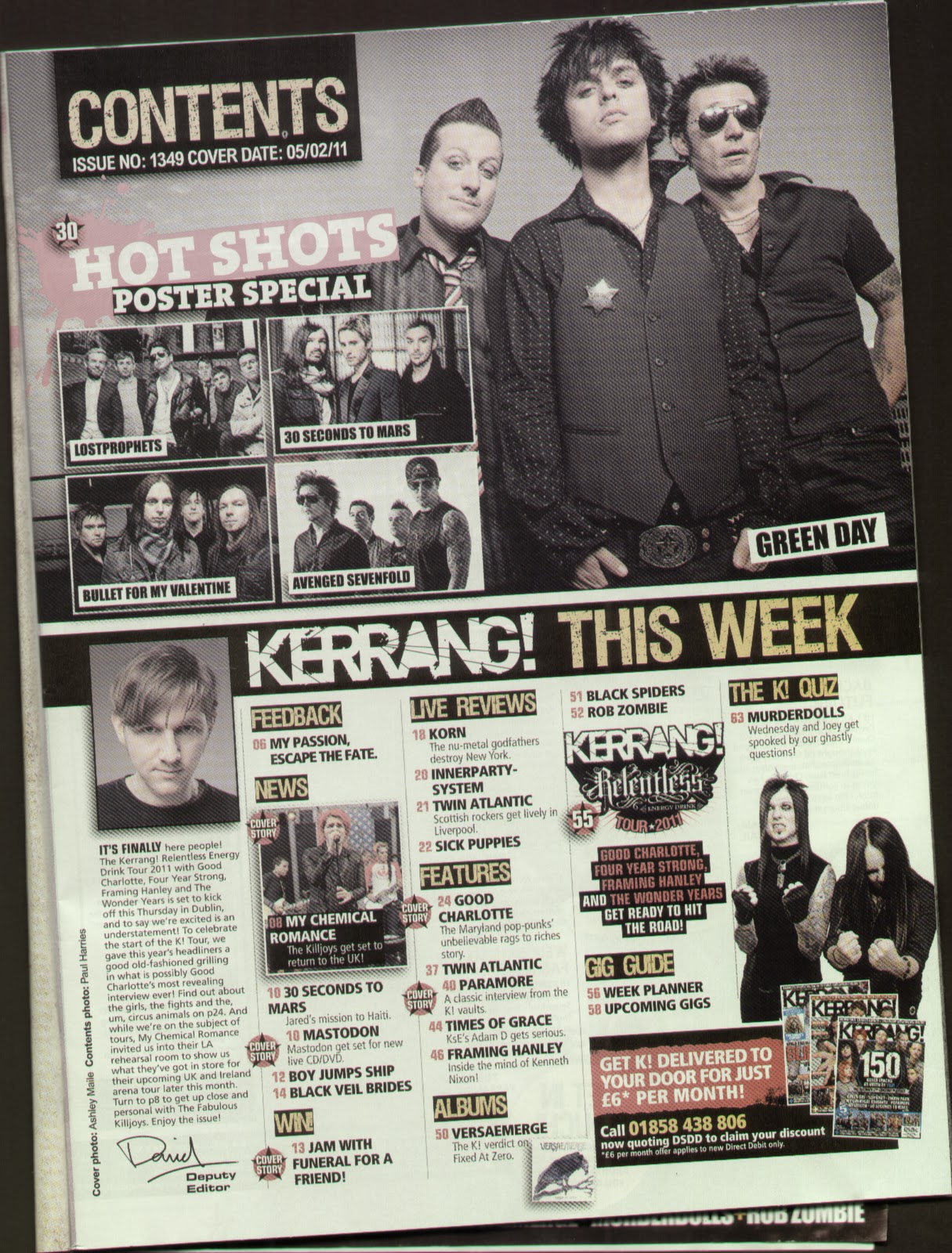
The contents page is set out in two columns with a large strip separating the two sections as it only covers one page. At the top of the page there is a red banner which repeats the title of the magazine just slightly smaller and in white instead of red. On the right of the banner the title contents page is bold in an Arial like font but underneath a line is the issue number and date of issue.
The left column has two images at the top which relate to the list of articles on the right hand column however the main image on the contents page is of the film section which is something I will not use in my music magazine. Underneath the images is a small editorial message which has a photo of the editor with somebody else which is then signed and has an email address to help with communication to the magazine. The editorial is written in the first person therefore is a very bias bit of journalism that can be on anything which relates to the issue or what has been happening in the media with relation to the editor that week.
The right hand column is basically a list of articles and features merged into one which can be found in the rest of the magazine. Anything which has been advertised on the front cover has a stamp next to it simply stating “on the cover”.  Some articles which have a collective heading which are regular to the magazine have a light grey box around them. The colour scheme of this column and this page is red, blue and black.
At the bottom of the page on the left hand side is an offer which promotes subscriptions which is a big thing to any magazine especially music magazines. Underneath the advert in the block arrow is the web address in small print and on the opposite side at the bottom is the issue date as well as the page number.
The double page spread takes the form of a question and answer article and spreads the article in six columns over the two pages with the colour scheme of the two pages is black, white and red. The double page spread as a whole is more text dominated.
The layout of the two pages takes the form of headline of the artists name in bold large font and tagline of the article taking up the top third of the first page. Then the main image one and a half thirds on the second page and the rest of the article continued underneath.
The main article has one column of general article information which sets the scene and gives brief background information about the artist which the double page spread is about, in this case it is “Lilly Allen”.  The rest of the columns follow a regular question answer layout and structure flowing from column to column. The article finishes with letting Lilly give a message to the world and then ruling of the article which shows the article has come to a definite stop. Underneath the ruled line there is information of when fans can buy her latest album which is in the same font as the main text.
The images that are included in the article are both posed but both have different settings and compositional features used. The image on the first page which breaks up the text is an old photo taken for different purposes of the artist when a child. The image is tilted to an angle to make it more interesting and enabling it to fit it in to the gap in-between the two columns and has the caption written on the image in white writing so it is legible. The main image on the second page is of only Lilly in a typical seated photo shoot position because the pose is very precise and the costume, hair and make up are in pristine condition. Plus it is something I wouldn’t usually associate with Lilly Allen wearing.
The characteristics of a Word double page spread is the “fact time” logo which seems to be found at the top of the page of all feature pages within the magazine. The other characteristic which the magazine keeps throughout is the web address, date of issue and page number at the bottom of each page.

Thursday 3 March 2011

MOJO magazine analysis

MOJO music magazine
The front cover of MOJO is black and white giving it its alternative edge straight away allowing the reader to determine the genre instantly. The page is also dominated by text as there are no spaces left which is a method some people see as cluttered and some see as professional because they are using every available space and not wasting paper.
Queen being about the same size as MOJO makes it more important because the band name can sell the magazine by itself. The colour scheme also includes rustic silver and gold creates royal connotations of “Queen”, but the rustic effect symbolises that they are an old band and haven’t been around for quite some time.
Freddie Mercury being the positioned in the centre of the page with his head in the top middle third with his eyes looking straight at you helps you to understand that even though the page says Queen first the article is all about him. The way he looks straight at the camera and is hugging himself suggests that reading the feature article you will find out about who the real electrifying front man once you stripped back his persona on stage and rock god image. I get this impression because the pose makes him look vulnerable. The fact that it is in black and white and not the best quality demonstrates that it is an old photo reused which is more apparent and noticeable saying he is no longer alive. This also means that readers can tell what type of feature article it will be by the cover artist; in this case it will be a look at the history of one of the most well known front men of the last 50 years.
The majority of the text is written in a sharp font except for the word plus which the editor has decided to take on the persona of the word and write bold and rounded. The main theme throughout the text is that artist’s names are more important than catchy headlines. At the bottom left of the page there is simply a list of artists who are also included in the magazine including massive classic rock names such as ‘The Who’ and ‘Airplane’.  Throughout the language itself MOJO uses a lot of superlatives as persuasive techniques on their front page but they are all included in-between the title of the magazine and the name of the feature artist in the centre of the page. They also seem to use a lot of exclamation marks to make the text look amazing to the reader.  
I have also noticed that every heading is rustic gold and then the writing underneath is rustic silver so they have an ongoing colour theme which is also used through the writing as well. They also use a top corner incentive of a “FREE CD” with the small print and helpful legalities writing in minute font at the bottom of the same side. On the opposite side of the page in the same place is the barcode which on this occasion is horizontal and includes: the date, issue, the price of the magazine when bought in the UK as well as USA and Canada.  
The contents page is image dominated because in this case the image is used to fill the whole page however like Q this contents page actually covers two pages however I have chosen one to analyse as I will only be doing one page in my product. For this genre I don’t mind an image dominated magazine as it brings vibrant colour to the page and doesn’t make it overly busy.
The quality of the photograph used for this page is amazing the way that the subjects are off centre and fully in focus whilst the background is just a blurred whirl of colour and even though there is someone standing behind the artists in focus it doesn’t matter because you don’t notice. The setting of the photo is abstract which is in keeping with the alternative genre.
The layout is spaced out but organised with the list of features skirting the edge of the main focus of the image. Each headline written in white bold and rounded font with a brief description underneath in smaller text which I would say is about text size 12. At the top of the page the magazine title is written again in its stylised sharp font and boldness, but in white this time to keep in with the colour scheme of the new page. The colour scheme for this is completely different to the front cover however it still uses two colours for the text. On this page the two colours are peach for the page numbers down the left hand side and white for the rest of the writing. The titles of the page sectioned which are lined out are also written in the peachy colour highlighting that general features are different from the cover story. The cover story is situated at the bottom of the page in a section by itself.
On the bottom right of the page a quotation is used to advertise the arcade fire feature article to the reader. It is written away from the rest of the features because the feature article is the one which is photographed.
Characteristics of a MOJO contents page are to always have the three cities where the MOJO headquarters are located within the countries in which it distributes its product to. It also always has the date and issue number in the transparent banner underneath the magazine title. Also not forgetting the tiny page number and the title of the magazine just made smaller still in a white font.    
The double page spread is a history article looking into the life of the classic and iconic front man of Queen, Freddy Mercury. This is a common feature of MOJO as they like to remember the legends of music especially those who have died before their time.
The page has three different fonts, not including the MOJO logo which is written at the corner of each page next to the page number. The first is used, next to the large bold drop letter which creates an obvious start to the article, is the initial paragraph to describe what the article is about similar to that of a lead in a newspaper article. The fact that it has characteristics similar to that of a newspaper summarises how good the quality of the structure and the content is in the magazine making the target audience of a mature age. This is due to the amount of writing included and the size of the font used for the main body of the text. The second type of text is used for the main body of the text and the third is used for the quotation underneath the main image on the second page.

Images are used in variety within the article as if an extra lining tactic by the editor as part of the layout. The margin image of Freddy’s head and flared and booted foot creates a straight line for the article to handrail down the page making it look more neat and sophisticated. The four images on the first page are laid out as a window act as a page break to break up the continuous prose which the article takes.  The images as well as the page continue the colour theme from the photography on the front cover through to complete the article with a running theme; in this case it is black and white.

NME magazine analysis

NME magazine

NME’s front cover has a busy layout which appeals to the rock, indie and alternative genre. The colour scheme used also appeals to those genres as it uses bright primary colours prodominantly used on a black background to make them stand out and look more appealing. The paper used to print the magazine is glossy and professional on the front cover.
The first thing on the page that draws a customer to the magazine is the photo because Pete Docerty’s heda is possitioned within the top and middle third. The photographer has also succesfully managed to make the image focus on Carl to Pete and back again which makes you realise it is all about them. The costumes and props that the two Libertine legends are wearing relate directly to the rock genre that they come from because it suggests everything under the rock and roll image. The unwashed look and the sleepless eyes, the two bottles of champagne which they are drinking from indicate intoxication and a love to party. The cigerette in Carl’s hand suggests that they don’t care about the future they just want to “smash” now. The colour in which they are wearing is a direct link to the rock and roll look aswell as one of the traditional colours assosiated with NME.
The small inserted images which litter the page to contribute to the busy layout all refer to what can be found in the rest of the magazine and all seem to be taken outdoor with natural lights however some of the stage photos from the outdoor stages at Reading and Leeds demonstrate a variety of lighting typical gig photos. These images continue the rough cut vibe as they are not clean cut, best quality and have no visible thought put into the photography however they give a real insight to the feel of the festival which is what the whole magazine is a review about. The insert at the top right hand corner is the posters used as an incentives to pursuade people to buy there product. The decision to use the arial shots of Reading and Leeds festival is very clever because people who went would love to buy it and play tent spotting (like wheres wally) creating a great memory saver to keep forever.
The text on the page is mainly bold and in capital letters except for the date above the magazine title in the top left corner of the page. The capital letters on all text represents all those times at gigs where you have to shout because you cant hear and that is the crowd which NME caters for because being called the ‘NEW MUSICAL EXPRESS’ it does as it says, acts as a new music guide. The way the ‘united they stagger’ is written in a simillar arty font to that written on the thumbnail posters making you think that there is a link to the piece of writing and the festival which juztaposes the main photo. The tagline itself is very cleverly created and so is the other little taglines and captions related to other feature articles at the bottom of the page like the alliteration of ‘Blonde ambition’  and the direct link to the lead singers change of hair colour. Shortning Munford and sons to ‘Munford’ as if to highlight a friendship with the band which enables them to do that.
The banner at the top with the Reading and Leeds logos on it demonstrate that this issue is a special review and not just bands as the main features. The AXL Rose badge seems to be an added part of the front cover because it was not expected and the way that they dont make it large indicates that they dont want to make a big ‘expose’ on the story they just want to acknowledge what an idiot of himself he made and that be the end of it.
Aswell as having the specialist features to NME they also have the typical thing you expect to find on the front of the magazine like the barcode which is turned round to the side but still situated on the bottom of the page where it is tidily out of the way but still easy to find and clear which is helpful when buying. Extra information found on the barcode are the website, the date (again but smaller).                                          

The contents page is 100% blocky layout with the heading centred at the top if the page which flows down into the blocky columned layout. The pages from now on in the magazine are like newspaper paper slightly rough which continues to add to the feel of the magazine because it’s new meets old in every issue.
Even though this is a contents page there is barely any writing on the page compared to other magazines therefore it relies on images to sell the story along with the information already given on the front page, which is limited. However the strong structure of the “INSIDE THIS WEEK” page being the same every issue makes it easy to navigate, understand and absorb the information. With the main cover story feature in the middle of the page directly underneath the heavy heading but it gets the most space allocation on the page. Other features fill up the left hand side using different fonts depending on the artists sub genre and boldness depending on feature hierarchy. The headlines are mainly quotations therefore one of the trends of NME is to use allot of quotations within the magazine.
The bolder the heading the bigger the feature will be. The bottom right hand block is filled by an advert full of persuasive language in order to try and make you subscribe to the magazine. And the mini thin column “PLUS” is where the regular articles where simply listed: page number followed by the regular article heading then the next page number.
The photography on the page reflects diversity through the artists, setting, style, lighting and colour.  No photos are repeated and by actual re using or by the creative compositions because they are all different which I believe airs a high level of professionalism by having a good back catalogue to use.
The page also has minute font on the left hand side turned on its side as if in the margins of the page which is the credits to the editorial and photography however there is no mention of ‘NME’ anywhere on the page.

The double page spread is set out as two separate pages with the image covering one page and the article on the second page. The image used for the first page is a similar composition to the front cover image as Carl and Pete have barely moved and the costumes are the same therefore taken on the same photo shoot.
The title of the article is a quotation said by the artist which is a common thing found in NME. The main article itself takes up the majority of the second page however there is a smaller addition at the bottom of the page of box pops asking other artists what they thought of the Reading and Leeds festivals. The images used for the mini extra addition to the feature is mainly to fill space, add extra images of a thumbnail size and more quotations. The content of the article uses a lot of quotations, ellipsis and text within text referrals to lyrics and other bands. Drop letters are also another method which NME but only for starting off an article.
The images used throughout the article are varied using mainly posed photography as there main image however they have included an action photo from on stage at the festival to create photo diversity. The use of the red of the additional box pop’s at the bottom of the page, the highlight of the quotation as a page breaker in the middle of the second page and the vibrant colours coming through from the action photo all show representation of the feel of NME magazine.

Tuesday 1 March 2011

Q magazine analysis


Q music magazine
This front cover appears to be pristine having a precise layout with a complete emphasis on the cover artist as the image fills the whole page. The colour scheme of red, white and gold  gives connotations of high status and wealth which adds to that pristine look.
The image itself is posed photo shoot photography using the common band same look costume however the actual composition of the photography used is made to look natural. The way in which the photographer has played with the personalities of the band instead of having them standing like a typical group photo of the pop genre would insinuate, which shows that Q as a magazine don’t want to just stick to one genre.  As well as the happy facial expressions expressed the positioning of Robbie on the bottom of the pile emphasize that they aren’t letting him get away this time and he is here to stay. The shadowing of the band still there shows that they are now men despite the boyish characteristics which they will always carry through.
The fact that the magazine only has the magazine headline and brief information about the band show that the magazine editor was proud that they got the ‘only cover’ and ‘world exclusive’. It also shows that the band is so well known that they can sell the magazine by themselves.  
The way that the issue number, date of issue, price and website are added to the barcode keeping it need and tidy as if the layout is used for every issue making it professional. The minimulistic textual content found on the front cover is all in sharp font which doesnt use all capital letters. expept for the band name and "THE WORLD EXCLUSIVE" because it is something they want to shout about, a world exclusive is a big deal in the world of media, it can put you on the map.       

The contents page has the colour scheme continuing through and is usually set out over 2 pages with the ‘features’ on one page and the ‘regular’ articles on the other which is well used jargon in Q. however when i produce my product it will only be over 1 page.
The banner at the top of the page shows a semi border starting off the layout of the pages. The way that Q is written more than 4 times on the page shows that they are overly proud of their work or just like reminding people what they are reading.  The layout as a whole is blocky but the image still holds an importance on the page as it takes over more than half of the page and is of the cover artist.
The interesting thing about the main image of the contents is that isn’t completely a reused image. The same pose as the front cover photo and most likely taken at the same time as the front cover photo however the main difference is the image is taken from a 45 degree angle and was shot in black and white. I think that even though they haven’t used a completely different image the message you get from it is different, it seems to develop the idea that the magazine will look at every angle of the band within the double page spread article.
 The other image used on the page is a graphically produced mock up of the Q awards themselves as it is a recognised image to a regular reader or subscriber and gives the contents pages image diversity. Also by not being a photographical image it draws attention the article because its different, and people always want to know why things are different.
The way the text is presented broken up by a heading combined with the page number underlined by what seems to becoming the colour of the magazine, red, is very tidy and easy to navigate. The textual descriptions or written incentives persuading readers to read that article differ depending on genre and artist: factual content, quotations, cleverly incorporated lyrical references, a mini insight into what the band is like at a gig, witty puns, metaphors and reference to legends in the art of music.
The double page spread shows that the colour sche,e of red, white and red still continues through the magazine and the pages of text have kept their border like lines at the top and at the bottom to line up the text and keep the space organised. the pages being split as one page has the main image and the second page as the interview.
The image is still playing about with creative band photos which demonstrate the boyish humour of the band members especially as the photo is in . The band members heads create a line of focus into the photo therefore strategicly positioning Robbie at the front of the line tells the reader what the direct focus of the interview is.  It also makes an ironic joke that Mark is at the back when he is well known to be the smallest member of the ‘man band’ and he is strategicly placed at the back of the focus line so he is next to the quotation positioned in the top left hand corner of the image page.
The second page is layed out like you would expect a magazine article to be, in collumns and the writing is broken up in to small manageable paragraphs. The size of the writing sugests that the target audience of the magazine is high however the form in which the article takes, a question and answer article, develops that it is more for an easy read.  It allows the artist to have more of a voice and control over what is said as long as they respond to the questions answered therefore making it more of a relaxed interview script and a bit of a gossip article. By the artist getting the majority of control of the voice within the article allows an understanding of respect in which they have aspired over years of performing, but also basicly reflects how interested the audience in the unanswered questions from the comback.  The drop capitals make the text easier to navigate and provide extra pieces information to break up the question answer article however appart from the large drop letter in bold font the extra information looks as if it is fully part of the question answer section of the article.
The fact that the band name is simply the title of the article shows how highly thought of they are  in the music world they are and because of that their fans will simply see there name and want to read the rest of the article.
As well as the colour scheme being a continuous thing brought through the magazine the reference to Q at the top right hand corner and bottom of the page reminds the readers who brought them the ‘world exclusive’ of Take That. As well as the very helpful page number in the bottom right to the left of the magazine logo which appears like a vintage electronic number cruncher which adds to the all inclusive and professional feel of the magazine.

Initial ideas