Saturday 26 February 2011

audience research: Questionnaire

1. What feature artist would you like to read about?


2. What is your preferred music magazine to read?
Q
Rolling Stone
Kerrang!
Mojo
NME
Uncut
Classic rock
Alternative
Blender
Clash
Other please state: ____________

3. Which of these cover layouts do you like the best? Why?


4.what attracts you to a music magazine?
Artist named
Cover artist (photograph)
The quality of the photography on the front cover
The colour scheme
The title of the magazine
Incentives mentioned on the cover

5. Which type of artist do you expect to find on the cover of your favourite magazine?

6. List your top favourite artists (maximum of 5)?

7. What is your prefered colour scheme for a magazine?

8. I like ____ font on the cover.
[rounded, sharp, arty]

9. What features do you like to find in a music magazine?

10. What do you like the articles to be about?

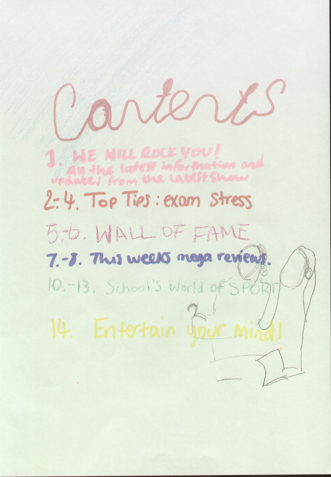
11. How do you like the contents page? Blocky or image dominated?

12. In what way do you prefer a double page feature
atricle to be set out?

13. What interests you to an article from the contents page?

14. What incentives would you expect with your chosen magazine?

15. Do you like it when special features create a special issue?

16. Do you prefer natural or posed photos?

17. Do you prefer LED lighting in photos(gig photos) or natural lighting?

18. Do you prefer to see bands on the front cover or single artists?

19. Would you like to see a female artist on the front cover for a change?
20. How much would you pay for a music magazine?
£1
£2
£3
£4
£5+

21. Is there any reason why you would not buy a music magazine? If so what?

Diary Entry: Week 3

Febuary half term
Over the last week I completed constructing my questionnaire and have then send it out electronically to my targeted selection. I selected my selection across the alphabet and tried to be as un bias as I could by selecting even amounts of females and males. I decided to use this as my sampling tactic to make sure I got a balanced and realistic response representing as close to what my target audience think as possible.  I have completed my initial research however my photocopier is broken however as soon as half term is over I will scan my work into the computer and upload it straight to my blog. 
Whilst waiting for results of my audience research I have selected 3 magazines, NME, Q and Uncut, and have began to analyse each one. I have also been working out what the last 2 magazines I will be analysing. At the moment I am deciding between choosing between classic rock and rolling stone or using one of those and then a contrasting music magazine.

Saturday 19 February 2011

Diary entry: week 2

Research
Since I last wrote I have been looking at a wide range of music magazines allowing me to get a wider understanding and pre knowledge of what I would be producing. Whilst looking at the magazines we picked out codes and conventions which appeared on and within the magazines, focusing specifically on the front page, contents and double page spreads.
After understanding what a music magazine entailed I created an initial ideas task in mind map form where I wrote down all of my ideas focusing on: layout, colour, subject matter, names and photography. I have also started to create a questionnaire which will include minimum of 20 questions enabling me to understand what truly makes a good music magazine. I have also selected which 5 magazines I shall be analysing for my codes and conventions write up and research. They shall all relate to my views on music magazines and the target audience highlighted in my initial ideas as the most popular and reflect my views on music magazines. However I shall also include a magazine which does not relate to my target audience allowing me to compare the differences therefore allowing me to get a wider understanding of the possibilities I can include in my final product.  

Friday 11 February 2011

evaluation of my "Bizzare BAY" my school magazine

In what ways does your media product use, develop or challenge forms and conventions of real media products?

My media product adheres to the typical codes and conventions highlighted in my initial research of school magazines. It does that because the title of my magazine is situated within the top third of the magazine and is in bold font. The bold font itself relates to the colour theme of the school and the alliteration used are great examples of conventions of a good school magazine used in my own media product.
             I challenged the conventions with the picture for the front cover and the contents page by creating more of a creative or arty layout. The image on the front cover being full page background only related to a special art college which I evaluated in ‘what do school magazines entail?’. The contents page develops what is already used in magazines where they use the list however they majority use the same colour for the whole list of contents I have used a different colour for each headline. This allows each article to stand out more in their own right and makes the contents as a whole look less boring. The heading of the page also challenges the  typical conventions as it is more arty, flowing and fun but it shows students that a boring page such as ‘ the contents’ can be fun to read.   


What have you learnt from the process of constructing this product?

            This preliminary task has taught me to understand what codes and conventions are in media products such as school magazines and how to find them, therefore giving me the basic footing to look at music magazines. As a project it has giving me great experience at working to deadlines and greater experience working on Photoshop to create a final product that looks professional. As well as a practice at the brainstorming creative ideas for content to include that is relevant to the target audience which I will also use in my main task.

Wednesday 9 February 2011

Diary entry: week 1

The preliminary task. 
Over the last week I have been working on my Preliminary task to create my own school magazine.
My first task was to research already existing school magazines and analyse the codes and conventions in which they used. I analysed 5 magazines: the front covers and contents page. In that week I also drew out my plan of how my contents and front cover should look using colours. These two pages I scanned into the computer and uploaded to my Blog.
After that I took my photos for the front cover and my contents title using my own camera. I then created the front cover and contents page on Photoshop. When finished I exported the final product as a JPEG file so I could upload onto my Blog. Which I am currently finishing the evaluation which will complete my preliminary task.

Tuesday 1 February 2011

School magazines, what do they entail?

School magazines, what do they entail?

The two most important parts to get a student to even read the magazine is the front cover and the contents page. However the typical layout and structure of each page is different.

A front cover has a colour scheme or theme of its own which is usually related to the school magazines title or ethos. For example the title itself is always found in the top third, or covering the line of top two thirds. This can fill a large amount of space whole space as this is what draws attention to the magazine itself. “CHiLL”  is a great example of a contradicting magazine in terms of its design beause the colour scheme completely contradicts or juxtaposes the title of the magazine; ‘CHiLL’ has connotations of being cold whereas the connotations of the colour schemes are warmth. 


 The fonts used for the title are usually bold and neutral colours, black and white however “Bishopbriggs Academy” has used a blue font for the title of the school and simply writing the word ‘magazine’ in grey.
The choice of the lower case or capitals depends on what effect the editor of the magazine is trying to create. The editor of George Stevenson High School decided to choose all lower case for there magazine “evolve”. 
The images used on the front cover tend to reflect the ethos of the place of education however they always include a student. “Fusion” an art academy magazine takes using a student in an image combined with the schools ‘art’ ethos by creating a Banksy-like image making it more attractive to its target audience. Another conven Also on the front cover are school emblems or logos and the name of the place of education.

In terms of language the front cover tends to use alliteration like for example “Top Terrace” is the name of a prestigious London schools magazine. Other magazines include quotations from inside the magazine and brief summaries or even a short list of articles which can be found inside. The last but most important thing found on the front of a school magazine is the date, issue, term and year.

A contents page generally uses images that are more trivial similar to that of clip art or graphics style which tend to add extra colour to the page and relate to the schools ethos.


Here are two fantastic examples of trivia clipart like images on the contents page which stick with the theme of the page. Fusion on the left sticks with the ethos of the ethos of the school but also includes the recycle symbol. It also includes the month of the issue which is a complete contrast to the other magazines as they all show the issue on the front cover.


image from the 'CHiLL' contents page


However some schools choose to add images that have a direct relation to the important or more interesting articles like 'CHiLL' uses photos of pupils. 'CHiLL' is also a contrasting magazine as it uses a bold and darker colour in the background were the majority of school magazines use a pale colour so the writing stands out more easily.


The main form in which this page takes is a heading at the top third of the page followed by a list of headings adjoined by its page number. The lists can be separated into sections of relating articles, e.g. sports and entertainment are two of the most used sections, or by the use of columns. As well as the name of each article there is usually a brief description of what the article entails and as great use of questions to make the reader want to read that page. 


This contents page is a great example of seperating the contents page into boxes therefore seperating the articles into sections. However this is more uncommon than you would of thought becuase the traditional collums with the simple list format is more popular.