Thursday 5 May 2011

Saturday 9 April 2011

Diary Entry: week 9

Working towards the FINAL MAGAZINE DEADLINE
This week I have been intensively working on my media magazine at every opportunity including staying behind on Monday, Tuesday, Thursday and Friday after school.
The Main task for the Mondaywas to rethink and recheck my work making sure that my new improved magazine looked proffesional enough for goign towards the final draft. I planned to take some more photos of Hannah on Thursday again in order to find a different photo to give my work photo divesity. 
The photos themselves i was reallly impressed with because the lighting was different creating a difrent look from the photo giving them the extra edge to be able to use in my DPS. I took various levels of close up on different angles and tried using different themes. In the end I went with the 'Rolling' part of my DPS. In the end I chose a very 60's pose but close up and to a sided angle still allowing me to keep Adeles usual facial pose but adding in her fun and bubbly persnality. However this photo took some selecting which took over 2 days and about 5 favourites but by using my opinions allong with peer feedback I feel that I have selected the right one.  
I have also added numbers to the photos on my contents page and made sure that the contents page didn't have to many fonts. The week finished with another list made of things that I needed to change at the begining of next week.

Saturday 2 April 2011

Diary Entry: week 8

Moving on from the Rough Cut
Monday was the Rough Cut deadline and i worked through my free and after scool to get my magazine saved into the Rough Cut folder on the disc box.
On tuesday and wednesday we looked at everyone elses in the casses work and wrote a feedback sheet for every one. Then we took tem all back, read through them and then typed them up onto the blog. 
The rest of the week I made a list on scrap paper of all the things I needed to change and began to make my changes straight into photoshop to start making the ammendments which wher mainly aimed at my Contents page.    

Friday 1 April 2011

Feedback from 'CONNECT' rough cut

Teacher Feedback

What they liked about my magazine
  • collums on the double page spread
  • image on the front cover and the mise en scene carried throughout
  • good photo on the front cover and use of colour scheme throughout
  • the use of colour and branding
  • manipulation of models
What they think i could improve for my my final magazine

Front Cover

  • check research -layout and fonts need adjusting/improving
  • logo could be stronger and changed to suit genre
  • more details included on the front cover
  • Adele image is to similar on front cover to on contents page
Contents Page
  • contents page is a bit messy - use constant fonts
  • photos could be stronger especially lighting on the band image (too much white balance on the photo)
Double Page Spread
  • photo is slightly out of focus on the double page spread
  • finish article after interview
  • "ADELE" on the double page spread doesnt fit the style
  • try to combine photo and text 
                                                  
Peer Feedback

What they liked about my magazine

  • constant colour scheme
  • images are well styled and look like the artists they are trying to be. They also show a variety in different shots 
  • text on the double page spread is the right size
  • the way the article is written, including the use of the collumns
  • consistant genre
  • the way page is layed out
What they think i could improve for my my final magazine

front cover
  • check spelling and grammatical errors (dont forget capital letters)
  • make the text on the front cover smaller
  • re cut out the front cover photo and blend with the background
  • move about the writing enabeling readers to read the "Tunstal" over the dress of the cover artist
  • wider variety of text on the cover?
Contents Page
  • make the text smaller and add more
  • the Adele image on the contents page looks stretched - resize or retake
  • too many plain backgrounds in photos
  • keep fonts constant
  • the page is slightly disjointed?
Double Page Spread
  • make the space inbertween "welcome to the party of the legends" smaller
  • adele title (font) doesnt fit with the layout
  • too much left over white space which needs to be filled
  • make the quote's bigger within the text

Friday 25 March 2011

Diary Entry: week 6

Construction begins!
This week I started to use photoshop to construct my magazine pages for the majority of the week I was working on the layout of the three pages. Once the pages were fully layed out I began to do some extra research for photos which was narrowed and information was fed into my photo planning grid. I also used my  sketched ideas as well as my existing magazine analysis of Q to work out what layout worked when inserting it into the Photoshop 4 software.
The thing which I managed to spend the most time on this week was trying to create a 'ALTERNAE' logo for my magazine with a wrongly slanting T, however when te calenge became to much I scraped the idea.   

Diary Entry: week 7

The construction continues
This week my magazine has really seemed to come to life because on Monday I managed to finish the basic layout, including the text and exactly where the photos would go on the pages by adding blank boxes temporerly. I also got in contact with my model who was being Adele to check her availability so planned to do them on thursday night infront of the white screen in the media room. I also told Hannah (my model) instructions of what to wear aswell as guidlines for make up, location and a time. Also on the Thursday i took my beatles photo to go with my DPS article, which the boys where suprisingly helpful for.  

Friday 18 March 2011

Diary Entry: week 5

Magazine designing has begun!
For the majority of this week I have been working on designing my magazine by drawing out deigns on A4 paper. Before I started drawing the final designs I looked back ove my initial ideas to try and put all of my ideas together in my head before putting pen to paper. 
By the time the ideas where sorted in my head I had chose Q as my style model and my cover artist was going to be Adele. My colour scheme is going to be red, grey and white to give it a proffesional and slick look.
When starting to sketch out the pages which I envisaged in my mind I also designed the magazine logo and sketched out photo ideas before researching poses used before to portray the arists as I knew it will influence what I thought was appropriate, therefore creating more ideas for my photographic compositions. I then created 3 A4 full designs for contents page, Double page spread and front cover. All 3 pages where then scanned into the computer and uploaded to my Blog.    

Monday 7 March 2011

Diary entry: week 4

music magazine research
Over the last week I have been working on completing the 5 magazine analysis' and sorting out my results from my audience research questionnaire.
I completed my reasearch of each magazine at a time instead of doing all front pages together, all contents pages together etc. I did this  because I believed it benefited my reasearch more by helping my understanding of a whole magazine and the themes brought all the way through. The magazines which I annalysed where: MOJO, Q, NME, the Word and Kerrang!. Kerrang! was a magazine I annalysed as an extra to highlight features of a rock magazine which I didnt want to include in my final product because it wasnt aimed at my target audience. All analysis' where added to a new post on my blog making it easier to navigate and browse when overlooking my research when creating my actual magazine.
For the audience research results I created a spreadsheet and added all the results from each person to a seperate sheet and then tallyed them on to a new sheet. When all results where collected and tallyed I made graphs for those questions which a graph could be made for, saved them as JPEG's and uploaded them as a new post to my blog.  

Friday 4 March 2011

quiz results in graph format

Graph  1 shows that Adele and Gaslight Anthem where the most popular bands to find a feature article about. For my magazine i will deffinaitly use Adele as my main feature because I already have someone in mind to be my model. Gaslight Anthem can be added as my second feature artist and any other feature artist will have to fit with the majority of the bands highlighted in this graph as equal.


Graph 2 shows that Q is the most popular music magazine by one person and NME is second as it only has one less. MOJO is the least popular music magazine with my target audience which is probubly because it is a magazine you either likeor dislike as it is very strong aternative audience.

Graph 3 shows that the majority of the people who answered my questionnaire prefered cover A, NME and M which was MOJO. I can see the logic by why half of the majority chose the NME cover because they selected it as there favourite magazine however the reason why te other half selected MOJO is different. The only reason M was selected as a favourite was because the colours selection creating the special edition. The main reasons why where that both front covers adhere to the codes and conventions of a conventional music magazine having the cover artist photographed in the centre or just off centre of the page with the eyes positioned in the top third. This is something which i will aim to include on my front cover.

Graph 4 shows that the overwhelming majority of my target audience choses which magazine to buy depending on the quality of the photos, who is actually photographed on the front cover and what artists are named on the front cover. To adhere to this in order to make my target audience want to buy my music magazine I aim to only use the best quality photos and only include artists which my target audience will be interested in.

Graph 5 shows that the overwhelming majority of my target audience think that artists in the  'indie/rock/alternative' genre are the artists they expect to find in a music magazine they would read. Therefore when planning the artists to include in my magazine I should make sure that they fit into this genre catogary.  
Graph 7 shows that the overwhelming majority prefer to see some red in a music magazine's colour scheme and not far behind are the people 'against black and white' as well as people wanting to see something glossy and sophisticated.

Graph 8 shows that a sharp font is prefered therefore this is what i will use to write the name of my magazine on my front cover.
Graph 9 shows that the top three features which people like to find in a music magazine are gig reviews, interviews and articles about artists. In my magazine i will include these three as the three feature articles highlighted on my contents page.
Graph 10 highlights that 'tours/gigs/festivals' and 'new albums' are what poeple like to read about. The next point highlighted by this graph is that they like to read about different genres.
Graph 11 highlights that the majority of my target audience prefer to have a contents page mixed of text and image, not overly dominated by one or the other. However two more people selected image dominant over text so when I construct my magazine I will use powerfull images but keep a more even balance.

The main result for querstion 12 was to use 'a variety of images set out in the text'. They also stated that pictures and collums where the best way of creating this concept on the page.

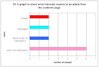
Graph 13 highlighjts that I must use artists which my target audience like and would appreciate reading about in order to make my magazine succesfull.  

 
Graph 14 shows that the marity of my target audience prefer incentives of posters and cd's if they are included in a music magazine as well as downloads.
Graph 15 shows that the overpowering majority of my target audience prefers special issues for magazines.
Graph 16 shows that people prefer naturally posed photographic compositions however they do like to have a mixture of posed and natural. Posed photos where also highlighted as looking more proffesional therefore I will use them for the impacting images on my magazine.

 
Graph 17 shows that the over powering majority prefer natural lighting being used for photographs in magazines so when taking my photos i will try my best to include as much natural light as possible.

Graph 18 shows that my target audience tend to assoca band with the front cover of magazines however 4 people stated that depending on what was featured is what will apear on the cover. In my magazine this is what I will use to my strength.


Graph 19 shows that the majority of my target audience would like to see a female artist on the cover of a music magazine.  


Graph 20 shows that the minimum amount that the majority of my target audience would spend on a music magazine is £3 and the maximum is £5. Therefore I will make my music magazine cost somewhere in the bottom half of that bracket.